ARTICLES
Imagination Encircles the World
An article published in The Scribe, the Journal of the Society of Scribes & Illuminators, Spring 2022,Number 112.
|
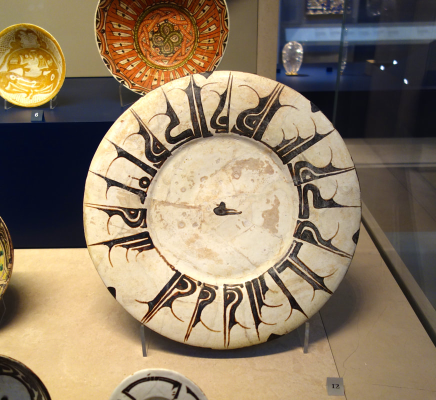
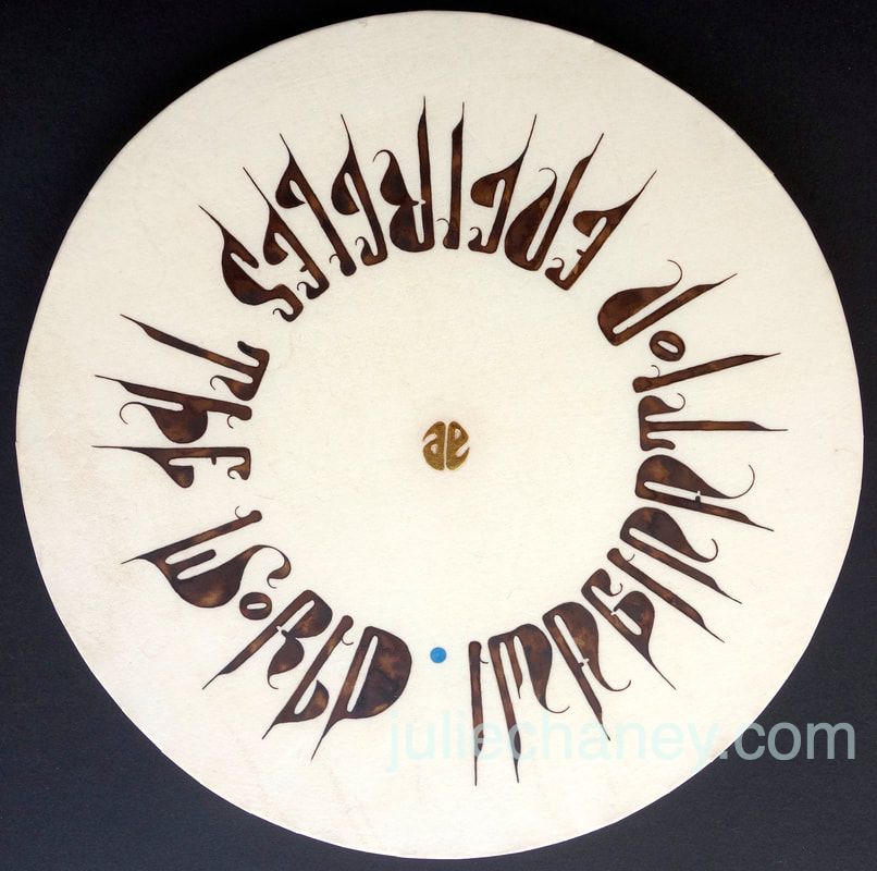
The inspiration for my piece arose out of a research day led by Cherrell Avery FSSI at the Victoria & Albert Museum back in October 2016. Our study group visited a series of different galleries and Cherrell highlighted many beautiful treasures, but it was a bowl in the The Jameel Gallery that grabbed my attention so strongly that its image overshadowed all the other items I had seen that day. The dish dates from the 10th century, it is from Eastern Iran or Uzbekistan and features an exaggerated, spiky calligraphic style. The description on the V&A website reads: ‘The decoration on this large dish is inspired by a metalwork technique known as niello. It imitates silver inlaid with black inscriptions. The potter covered the earthenware body with slip (liquid clay) to create a white ground for a contrasting inscription in Arabic in black slip. As on many Islamic dishes, the inscription offers good wishes for the owner’. |
|
|
During a practical session at Cherrell’s studio the following month, I began working up ideas for the project. My basic concept was to replicate the circular shape, capture the spirit of the symbols and echo a few of the textures if possible.
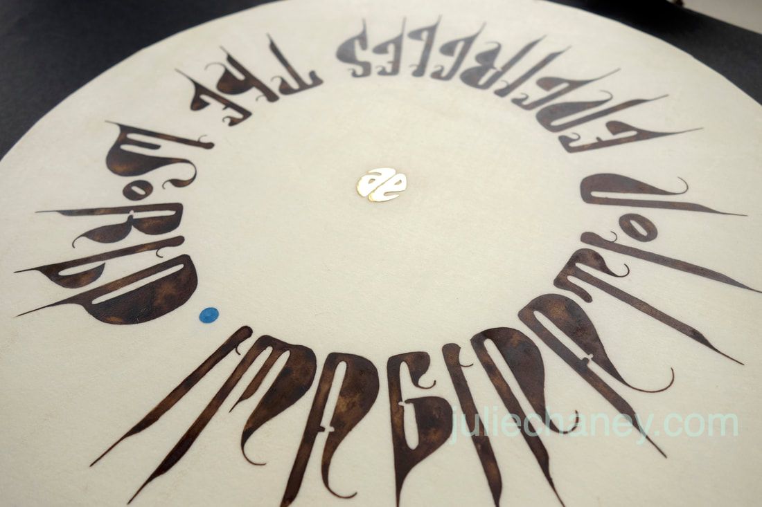
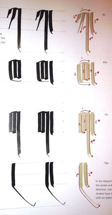
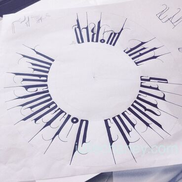
The entire piece would hinge on the lettering so resolving that was the first and main task. Cherrell introduced me to a book from her collection called ‘The World Encyclopedia of Calligraphy’(1), a compendium of hand-written scripts in many languages from all five continents. Within it, we found an example on which to potentially model my lettering: the Umê script, a semi-formal form of the Tibetan alphabet. (Umê means ‘headless’ and is a style used for both calligraphy and shorthand). Morphing our western alphabet into shapes that hang from a top line in a radial pattern was key to making this idea work. My intention was to build letterforms with a pen using the Umê stroke order as a guide and some of the familiar shapes on the dish resembling M, P, R and T made this feel achievable. But it became apparent early on in my writing experiments after much effort, that this was too demanding a task and the pen was abandoned in favour of drawn letters. For the words, it felt important to articulate the movement around a circle which led me to choose the phrase ’Imagination Encircles The World’, spoken by Albert Einstein. His full quotation is: ‘Imagination is more important than knowledge. Knowledge is limited. Imagination encircles the world’.(2) Starting with a pencil, a perfect circle and radiating lines from the centre as guides, I began designing in earnest. Around and around I went, drawing and refining, creating new elements and adding details on each rotation. The first drafts looked too rigid in their form and uncomfortably spiky. But by softening the lines and adding more curves and curls, the letters gradually took shape and began to have a sense of being in the same ‘family’. At the same time I developed a logo of Albert Einstein’s initials. After deciding on 28cm across for the finished size, I scaled down and positioned the circle of words to create a balance of white space both within the inner circle and the outer margin. My initial inked drafts in black Sumi looked too severe so I switched to walnut ink (van dyke crystals) to emulate the earthy quality of the symbols on the dish. At some point in the process I settled on a vellum-covered disc, albeit without any notion of how such a thing could be accomplished, and started with paper and mountboard mock-ups to test possible means of construction. I also trialled walnut ink on scraps of vellum, trying to create a textured, leathery look rather than a flat brown. Japanese plywood seemed to be the most suitable core material for the stretched vellum with two 5mm thick discs glued together for strength to minimise warping. A piece of calfskin, equal in diameter to the circle plus the thickness of two boards plus the length of the glueing flaps meant a whole skin was needed. Having become quite fixated on using vellum, I had failed to consider the expense of using such a large piece. Luck came my way in November 2016 at the SSI Research & Technical Day where Tim Noad FSSI brought along some materials to sell from the studio of the late Joan Pilsbury that included a number of full skins of vellum. Tim kindly helped me choose a high quality one for a very reasonable price. |
However, it wasn’t until many months later, in August the following year at a summer school with Gerald Mynott FSSI, that an opportunity arose to make the actual disc. Gerald was very enthusiastic at the prospect of stretching vellum around a circle; I was very apprehensive.
We worked out the dimensions, method and sequence meticulously before starting. A critical step was to make a series of precise, angled slits around the edge of the skin to provide flaps for glueing it to the back of the boards. The process was not unlike cutting baking parchment to line a circular cake tin, just far more nerve-wracking.
Mindful that the boards could warp with uneven pressure, Gerald recommended that we sit opposite each other, apply glue to an equal number of flaps, then simultaneously stretch and stick them down; turn the circle and repeat until all were secured. It had to be done quickly while the vellum was damp. It was a huge relief (and extremely satisfying) to see a taut, beautifully even and unblemished surface when everything had fully dried.
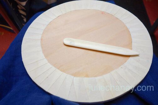
With all the fundamental stages done, it was time to finally complete the piece. I carefully traced down the design using Armenian Bole and laid gesso for the raised logo which I then gilded with 24.75 carat gold leaf. Next, I painted the letters with a fine brush and freshly made ink. I still had doubts about whether walnut ink would look textured enough on such smooth vellum but I was happy with the final result.
|

|
My decision on additional decoration was delayed until the main elements of the piece were in place when I could take a critical look. In the end I felt a tiny pop of colour was needed in the gap between the start and end of the quote. After punching out lots of differently coloured paper dots, it was a bright, slightly metallic blue that worked so perfectly. It also seemed to be the most apt: ‘Imagination encircles the world’ and our world is a small, round, blue planet.
Article and images © by Julie Chaney. All rights reserved
Footnotes:
(1) The World Encyclopedia of Calligraphy: The Ultimate Compendium on the Art of Fine Writing - History, Craft Technique by Christopher Calderhead (Editor), Holly Cohen (Editor).
(2) Printed in The Saturday Evening Post, 26 Oct 1929; What Life Means to Einstein: An Interview by George Sylvester Viereck.