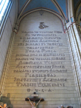
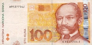
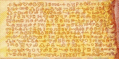
Originally written and published 12 November 2012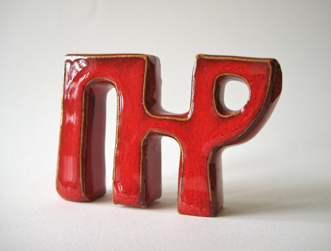 During a recent trip to Zagreb, I was fascinated to learn that a distinctive and decorative alphabet called Glagoljica (Glagolitic) exists that was used for centuries in Croatia before Roman lettering became dominant. 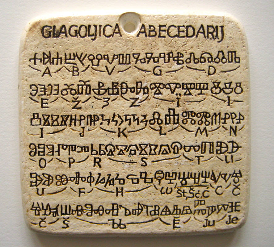 Small souvenir Small souvenir Whilst strolling through the city, by chance I wandered into a souvenir shop that had many items on display adorned with various unusual letter shapes. I thought they were ancient runes but the shop owner (who luckily spoke good English) showed me a poster she had for sale entitled “Glagoljica” and explained that they were letters from an old Croatian alphabet.
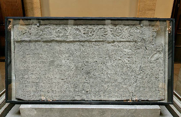 Baska Tablet behind glass 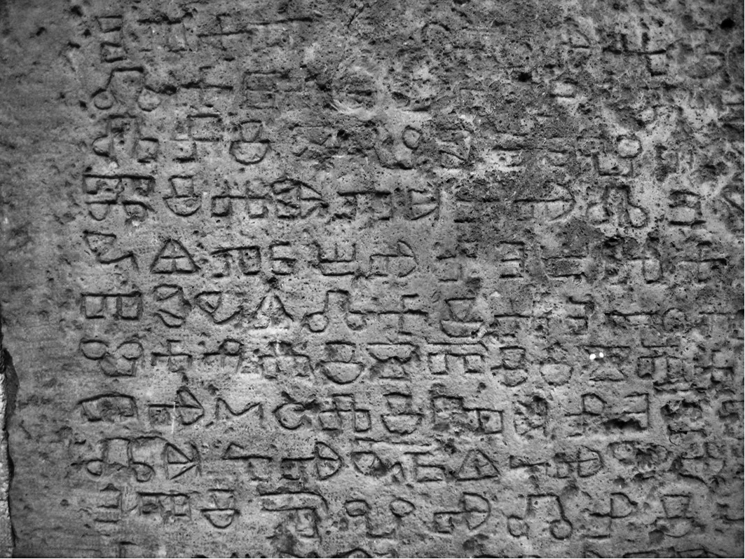 Section of Baska Tablet After the tablet was found, it then took almost 25 years before a full translation was completed but, unfortunately, the subject matter was not very exciting – it commemorates a gift of land by King Zvonimir to the church and gives details of attendees at the presentation ceremony. However, that is not so important as its real value lay in its use as a resource for studying both the development of Glagolitic script as well as the Croatian language.
The Croatian Academy of Art and Science website is here. My heartfelt thanks to the lady who owns Gallery Gea, Radeceva 35, Zagreb.
2 Comments
Originally written and published 30 April 2012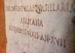 Thanks to my friend Simon the Letter Carver, I watched the first episode of “Meet The Romans” last night on BBC iPlayer entitled “All Roads Lead To Rome”. He said it was worth a look because of the wonderful examples of carved lettering that was featured in it and he was right. Prof Mary Beard brought the ordinary citizens of the empire to life – their professions, pastimes, social habits – through inscriptions they’d left behind. Those Romans certainly had a lot to say! They loved chipping away at blocks of stone, not just for special occasions or epitaphs, but for noting details of their daily lives, probably as much as we like blogging or tweeting today. 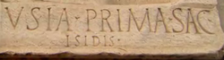 And I was captivated watching and listening as Mary Beard followed the lines of Latin words with her finger while she translated them aloud into English (as she did with one or two Greek ones too). It almost makes me want to learn to read Latin before my next trip to Italy, or is there an app for that? 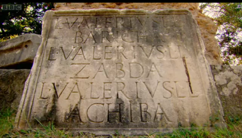 She enthused as much about small tablets etched with casual Rustic lettering as impressive monuments adorned with beautifully carved, classic Roman capitals. I might try to capture some of those images of lettering… [update : got a couple of screenshots, now added to this post as you can see!] And as a complete aside to the lettering aspect of this post, one of the highlights of the programme was the incredible site (and sight!) of Monte Testaccio, ‘broken pot mountain’. You’ll have to watch it to see what that’s all about! Episode 2 “Streetlife” is also on BBC iPlayer and is on the cards for tonight’s viewing. Originally written and published on 27 April 2012How do you make paper interesting? Well, leave it to papermakers GF Smith and you’ll discover it’s not only fascinating, but fun too! For the whole of this week they have occupied the basement of Victoria House on Southampton Row in order to show us all how quality paper is actually created and what beautiful products can be made from it. The exhibition, called Beauty In The Making, was designed to "celebrate 'the making’ as an art form in its own right” and was free to enter.  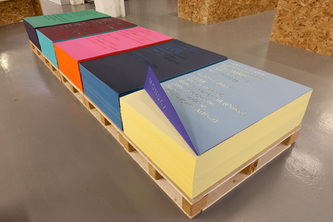 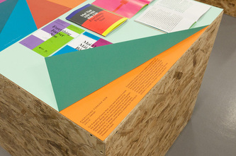 One of the event’s collaborators, It’s Nice That, have posted some excellent photos and a commentary on the event. Downey & Co, printers of fine & elegant stationery, joined in by bringing along a few tabletop hand-presses for printing out sample cards that everyone was eager to have a go on. Downey’s helpful and enthusiastic print experts were on hand to assist and answer questions. 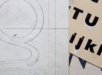 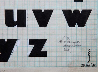    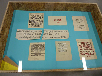 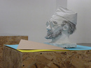 For lovers of lettering and the printed word, Monotype displayed (under glass of course) an exciting array of original pencil and ink workings by the renowned Eric Gill illustrating the development of his typeface masterpiece, Gill Sans. There was also a papier-mache bust of Mr Gill by Ann Pillar in attendance. There was plenty more to occupy the time from envelope-folding to speakers on a range of paper and print related subjects. There was a lot of interaction with both people and things. Rarely do I find exhibitions this much fun and GF Smith know how to treat a guest…they send everyone off home with a nice natural fibre bag printed with bright blocks of colour, chock full of their paper samples to play with later! Originally written and published on 24 April 2012.  Inspired by the Venice Carnival. Last Saturday was the 2012 Lay Members Day of the Society of Scribes & Illuminators held in King's College, Waterloo. It's an annual gathering and each year it wins my vote as the top event in the calligraphy calendar. A lady I met there told me that she comes away from the day feeling, on one hand, inspired and, on the other hand, depressed. I know what she means...the exciting work and demonstrations on show are indeed inspiring, but they also remind us that there's always lots of experimentation and work still to do! As a recent graduate of the SSI's Advanced Training Scheme, I was very pleased to be asked to display projects I had been working on during the last 3 years. I did imagine that my satisfaction would come from having my work on show, but the real feeling of gratification came from how genuinely interested and curious people were - about techniques & materials used, development of my pieces, and also in the scheme itself. It's quite surprising how much information people can share in a very short space of time! I wouldn't have been taking such an active part if it wasn't for the ATS so I was keen to sing its praises and encourage any potential recruits to apply and find out what it's all about for themselves! More thoughts on that soon... It was a wonderful day and I shall be looking forward to next year's event with anticipation. In the meantime, if you want to find out more info about The Society of Scribes and Illuminators then have a look here : http://www.calligraphyonline.org/
|
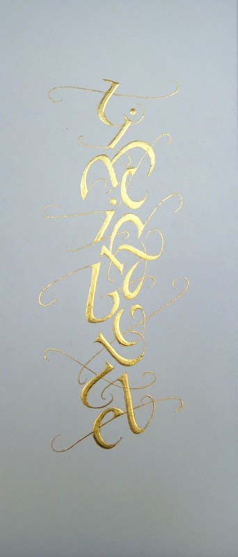
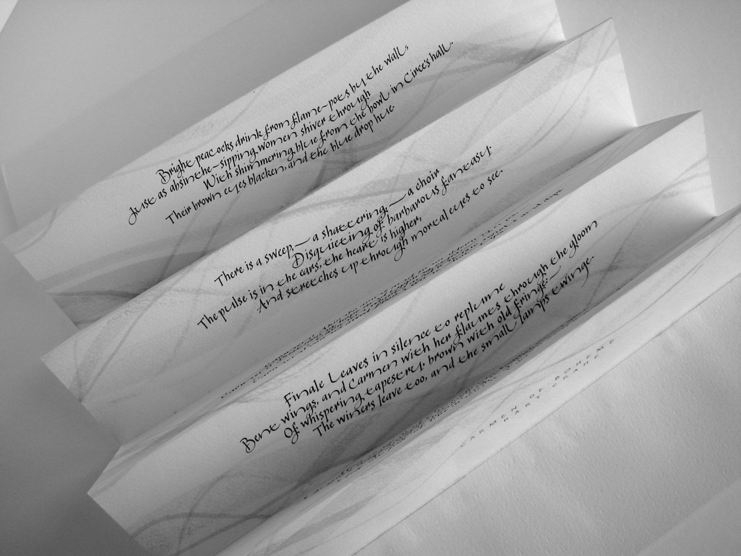
Julie ChaneyThis is a little corner where I like to share my love of calligraphy & letterforms and my fascination with the tools, materials & methods used to create and display them. I also love patterns and carved faces! Archives
August 2018
Categories
All
© by Julie Chaney. All rights reserved
|

 RSS Feed