0 Comments
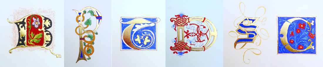
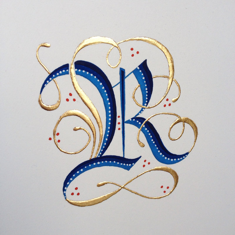
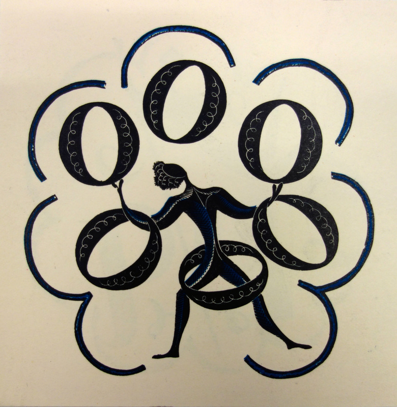
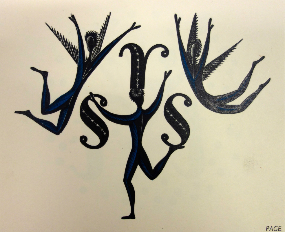
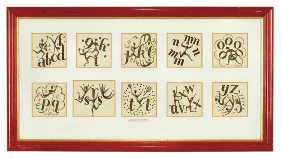
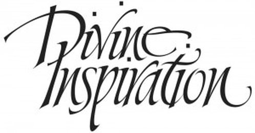 Logo design by Sally Mae Joseph From the website of the Society of Scribes and Illuminators... The SSI’s 95th Annniversary Exhibition, Divine Inspiration, was opened officially by the Sheriff of York on Saturday, 3 September 2016, in the Chapter House of York Minster. The exhibition received literally thousands of visitors, there are pages and pages of good comments from around the world in the visitors’ book, we sold 10 pieces of work and needed a second print-run of postcards. Repeated comments have been how varied the work was, how good the quality, and how nice it was to see well-known as well as less-well-known names. The SSI has really shown what contemporary calligraphy is all about. The November issue of the SSI’s Journal, The Scribe, will be devoted to the exhibition and feature colour images and details of all the exhibits. Read more on the SSI website COSMOS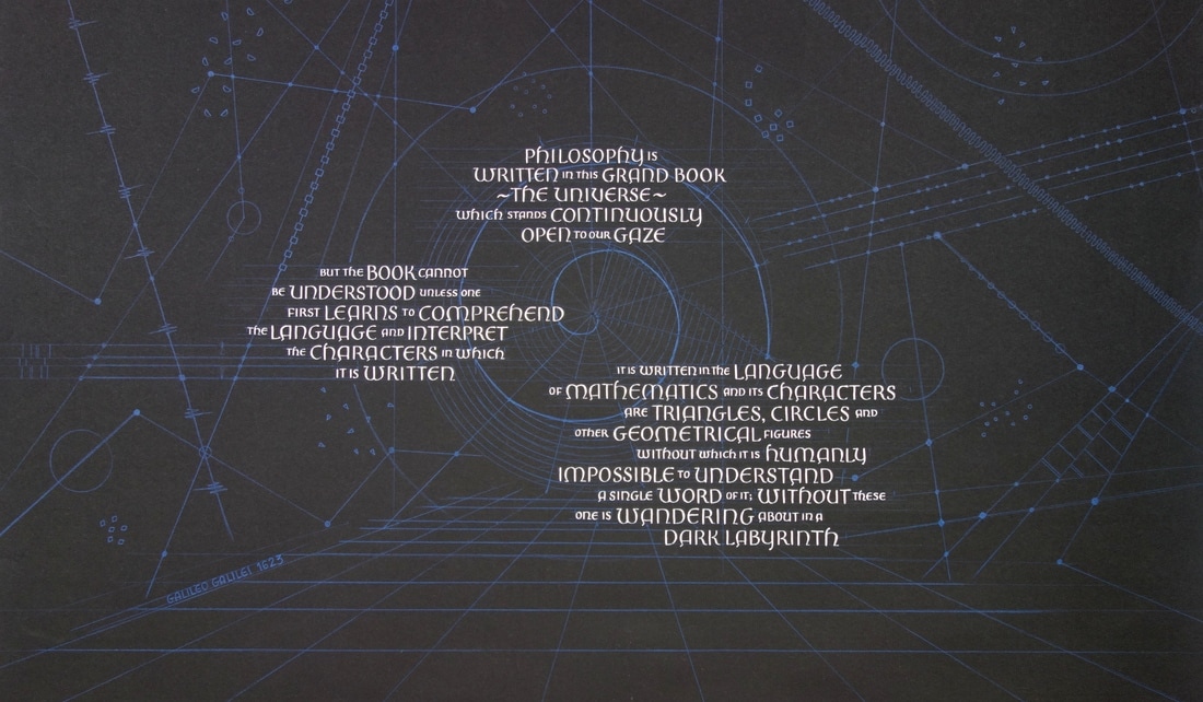 740 x 460 pointed pen, gouache, pencil on Bugra pastel paper It was a privilege to have my piece of work COSMOS accepted for the exhibition. I was also very pleased it sold. Full size and A3 prints are available to order. As an associate member of the Letter Exchange I was lucky enough to join other members on a excursion to Central Saint Martins, Kings Cross, to view some of the archive material held in the Central Lettering Record. Phil Baines, Professor of Typography, was our guide and introduced us to to the collection, which was started around 1963. He had chosen an exciting selection of images and artefacts, laid out on long tables for ease of viewing and handling, however, these were only a small sample of the huge volume that the Record holds. Here are some of my favourites. Eric Ravilious Beautiful and exciting lettering designed for the Monotype Corporation calendar of 1933
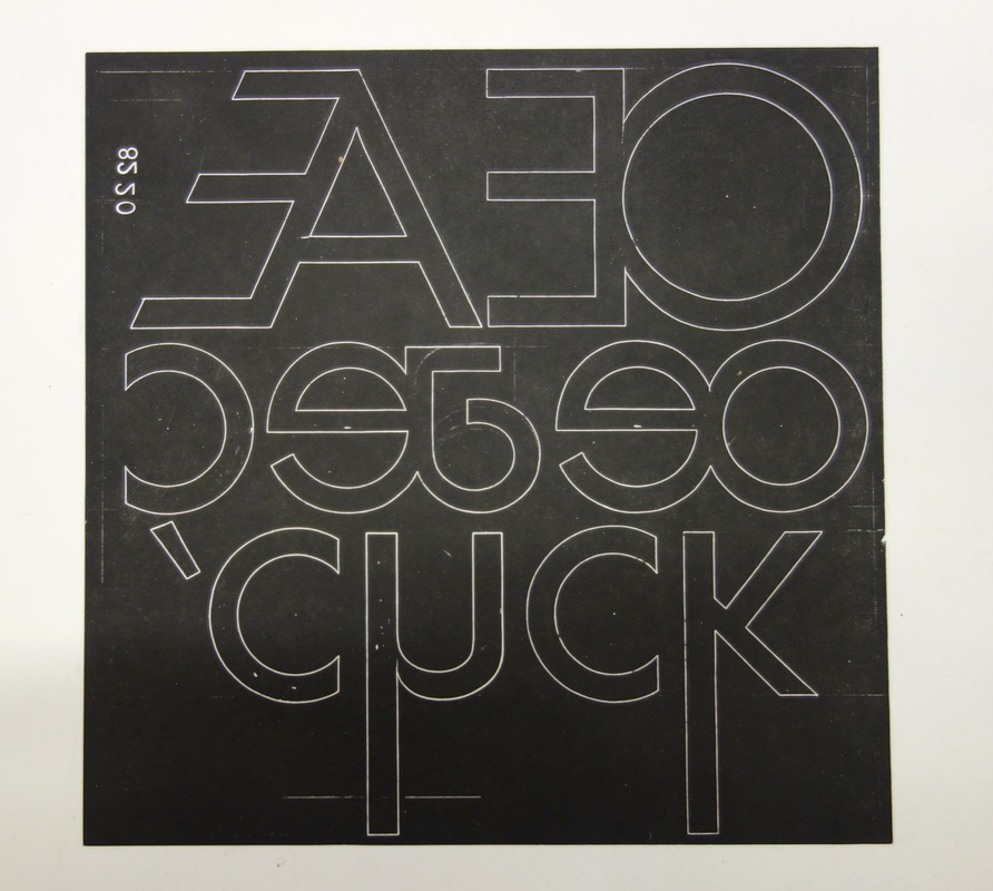
Paul Renner Pattern drawings for Futura typeface - includes experimental and discarded characters c1927
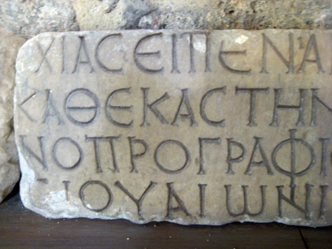
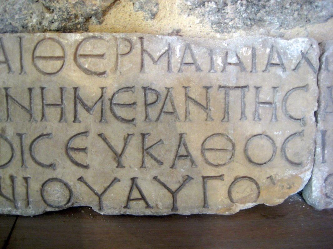
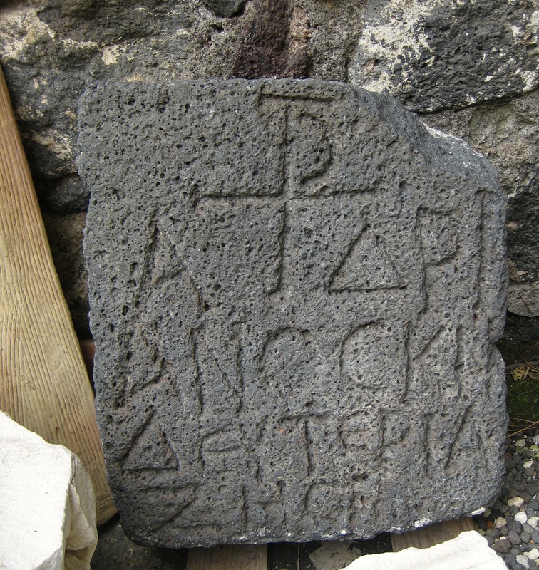
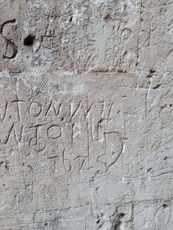
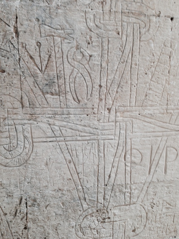
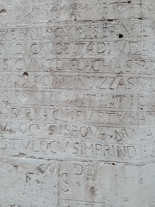
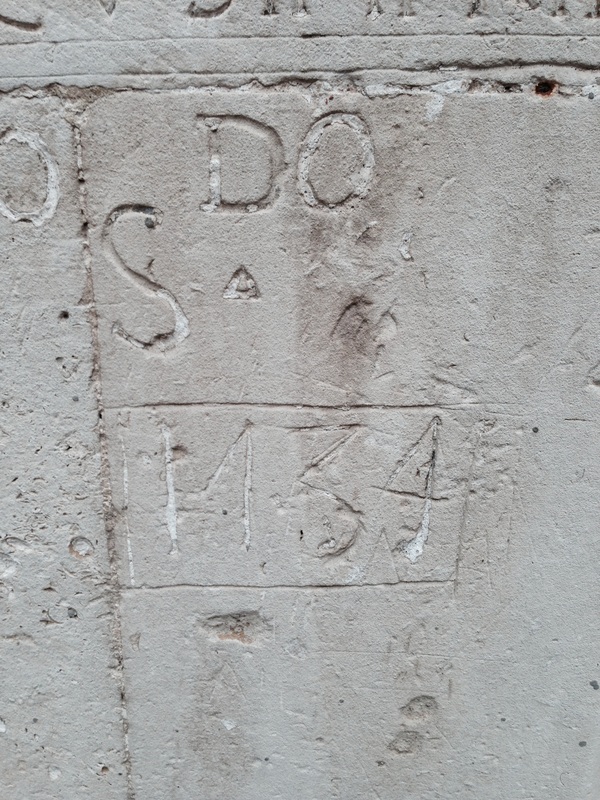
Castle Ursino in Catania, Sicily, was built in the mid-1200's as one of the royal castles of Emperor King Frederick II, King of Sicily. Today it houses the Museo Civico and so many interesting artefacts and works of art tracing the history of the city and the surrounding region. Greek stones with beautifully clear inscriptions; a fragment from the Thermae Achilliane describing the reduction in the waste of wood thanks to restoration financed by some notables of the city. Roman and Greek lettering inscribed into the ever-present lava rock. Less sophisticated but no doubt meaningful lettering scratched into the walls of the castle by prisoners.
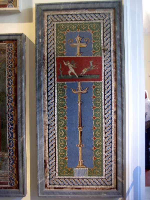
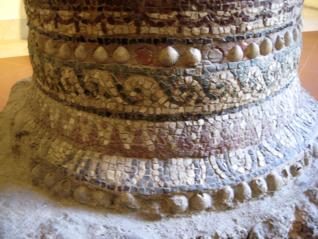
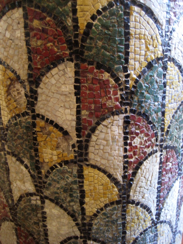
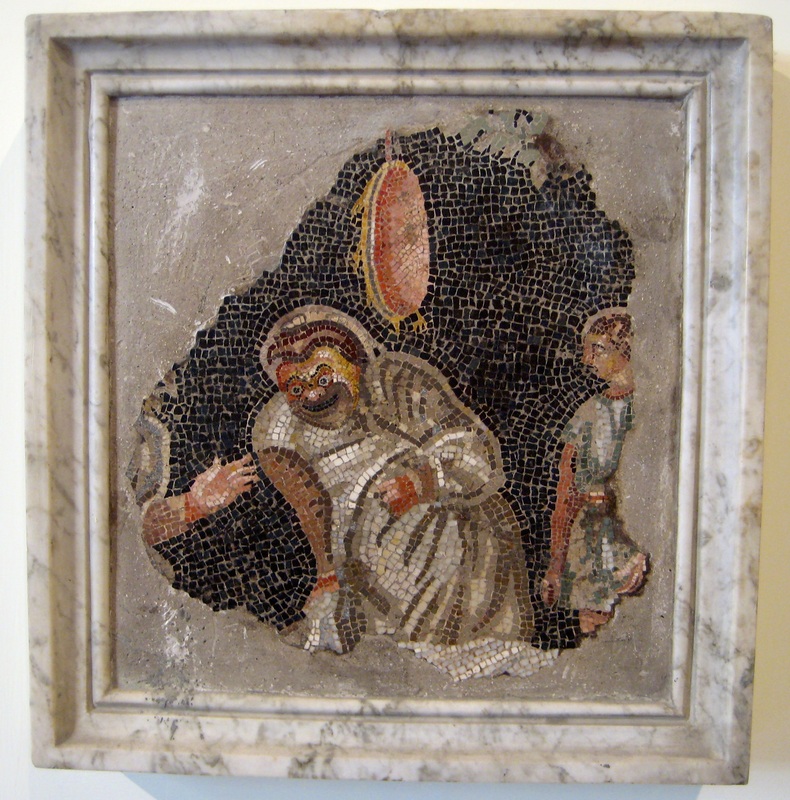
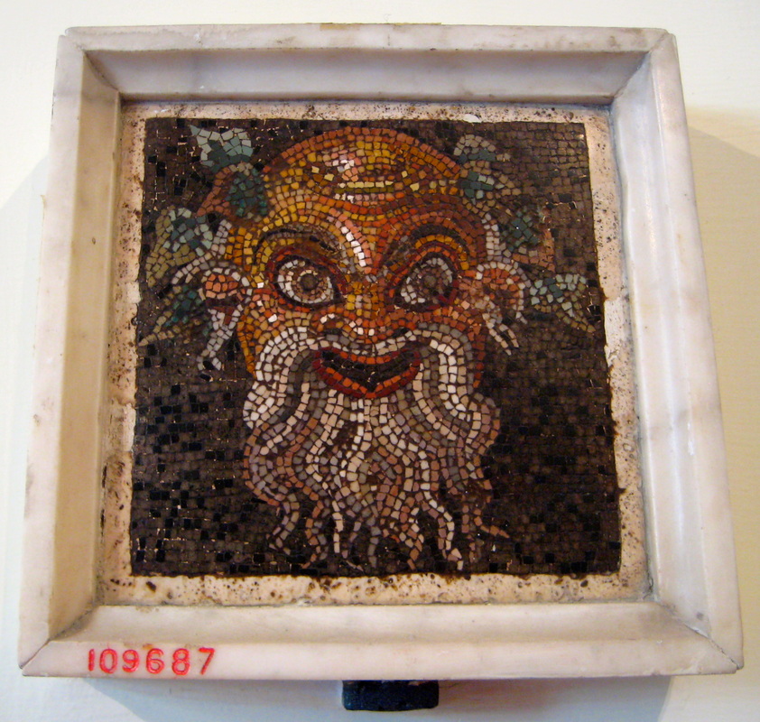
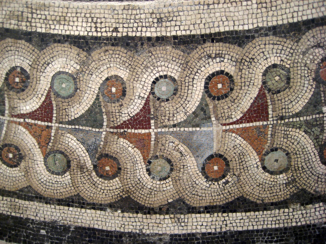
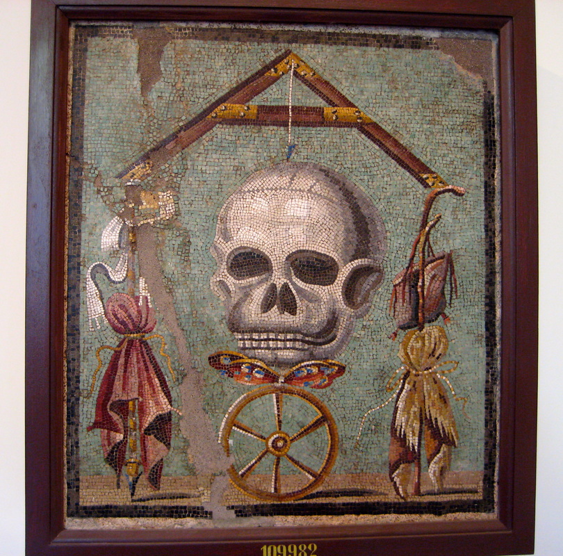
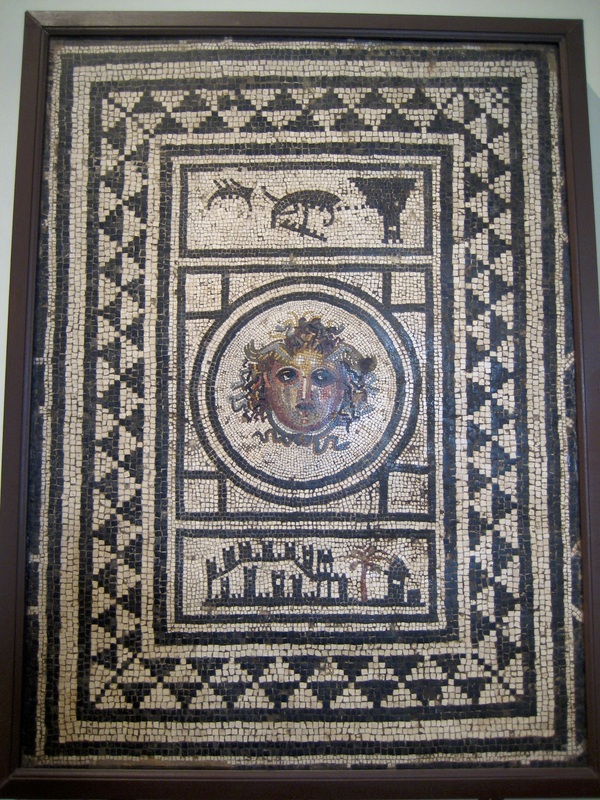
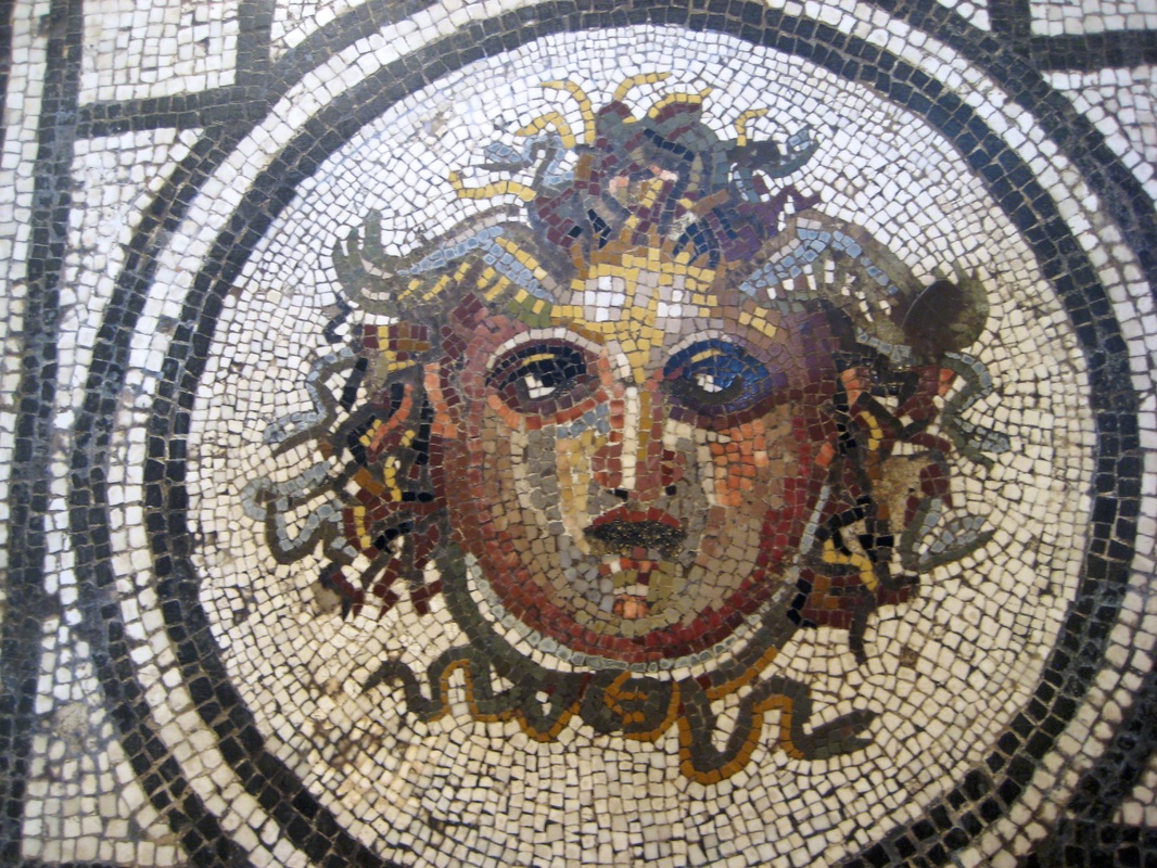
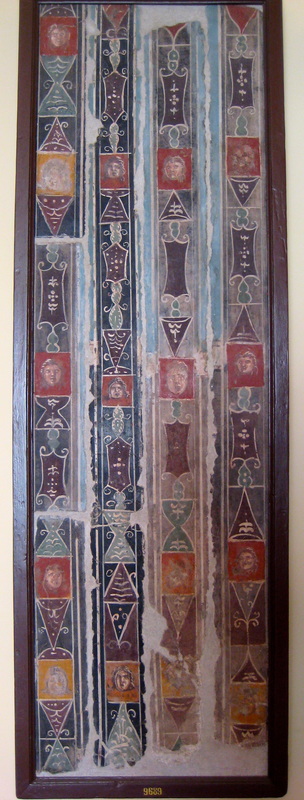
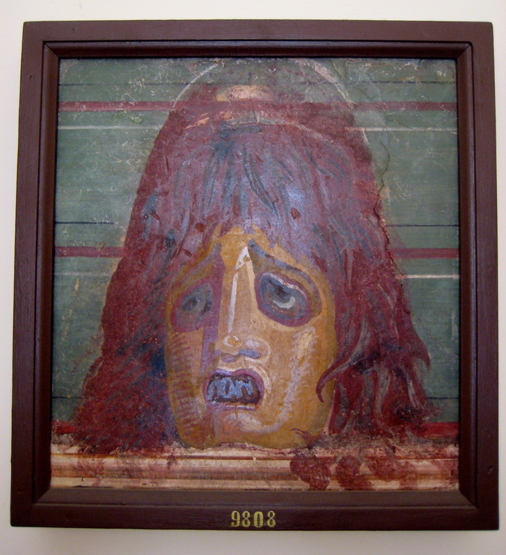
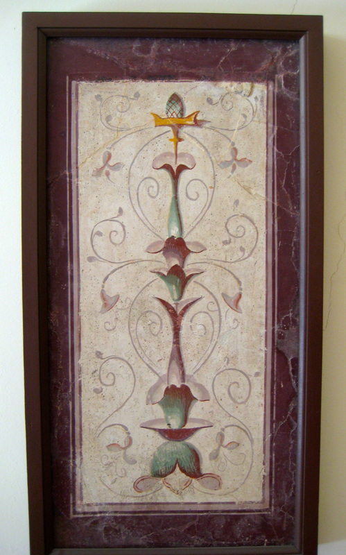
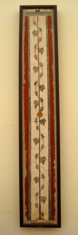
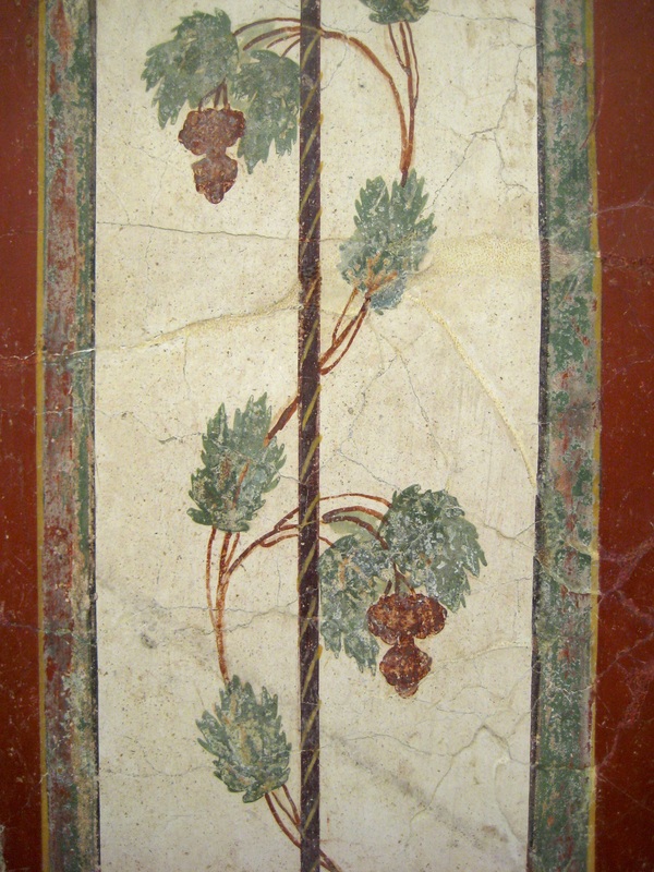
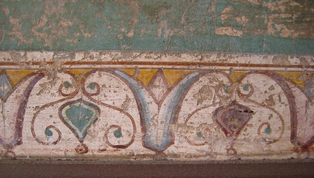
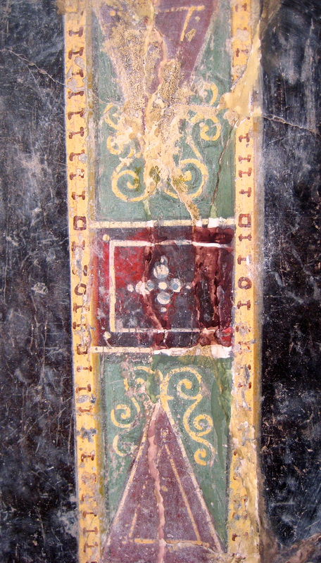
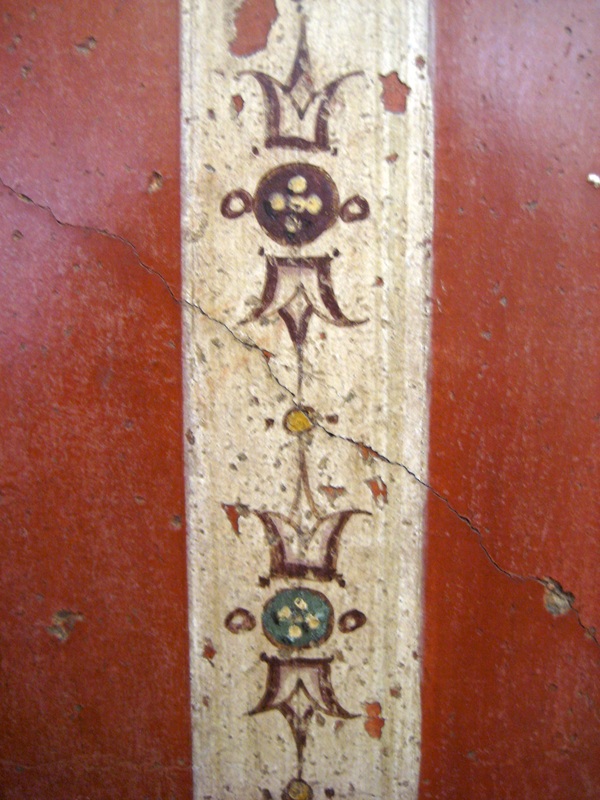
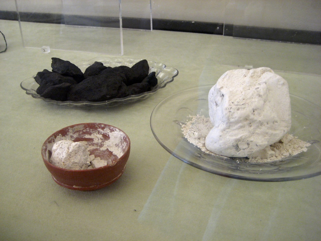
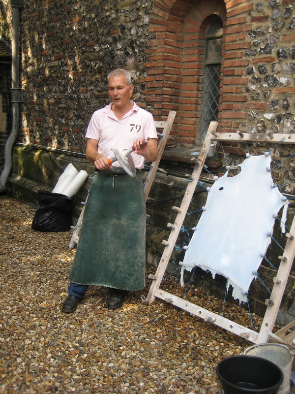
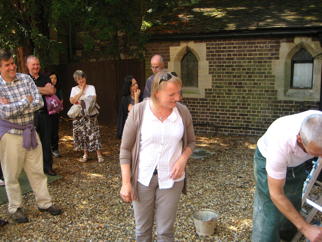
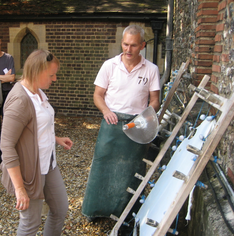
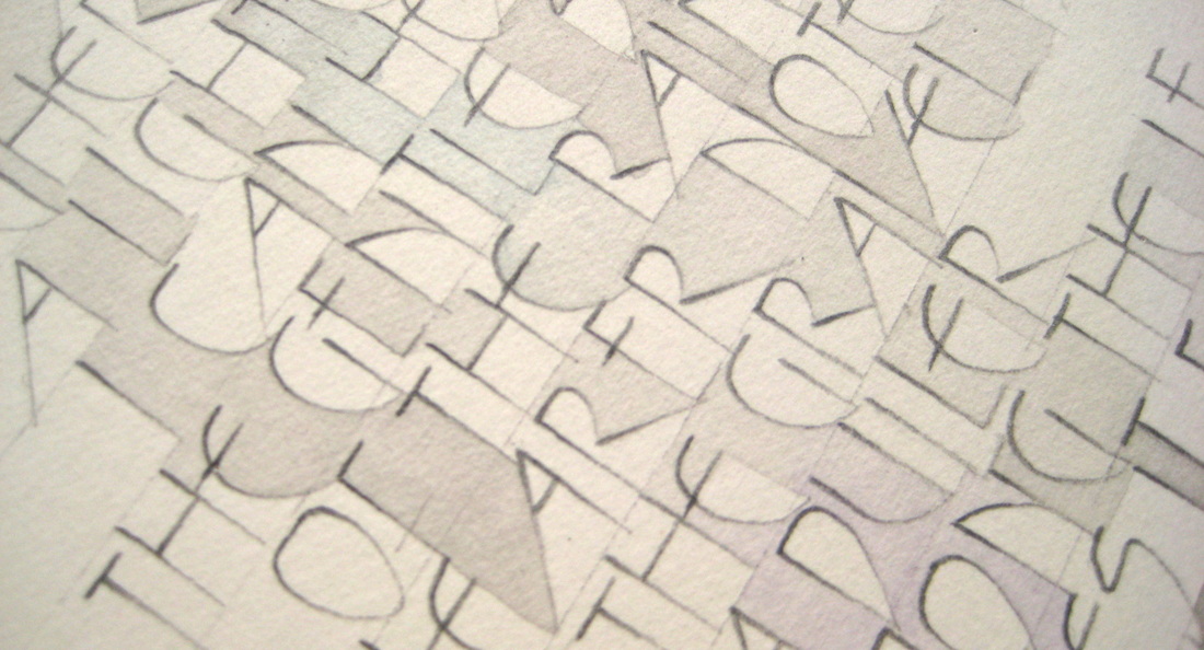
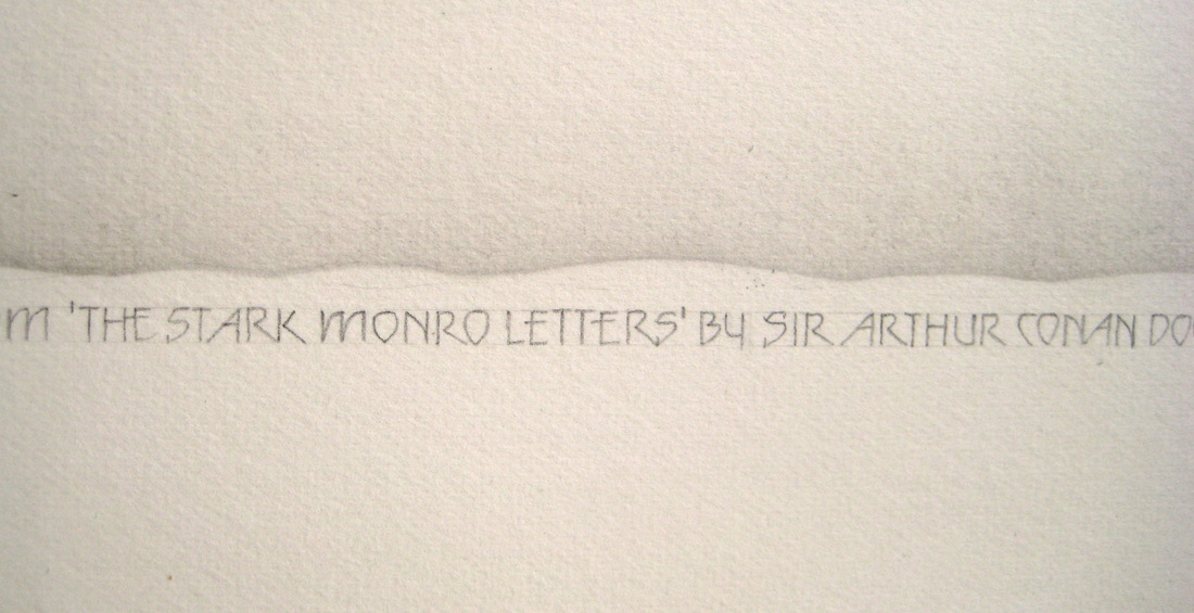
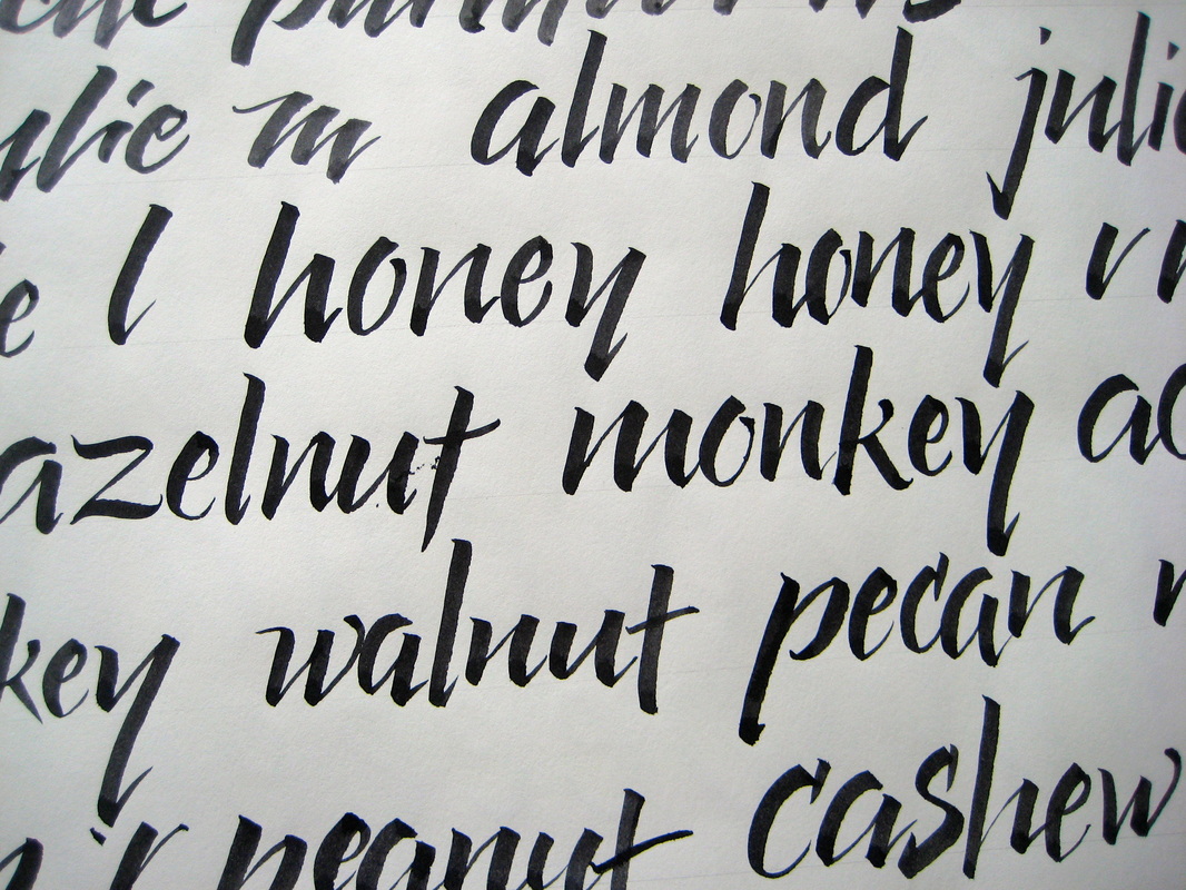
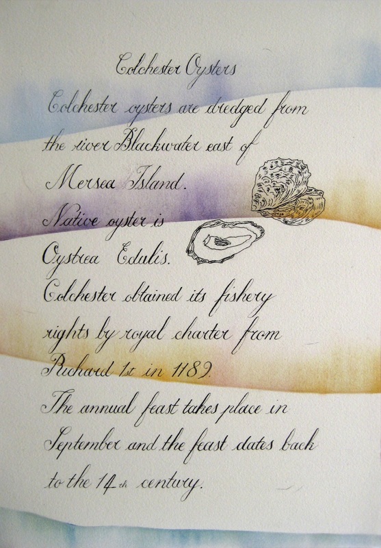
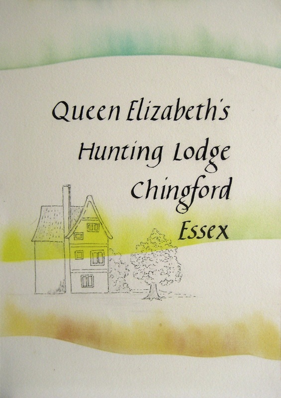
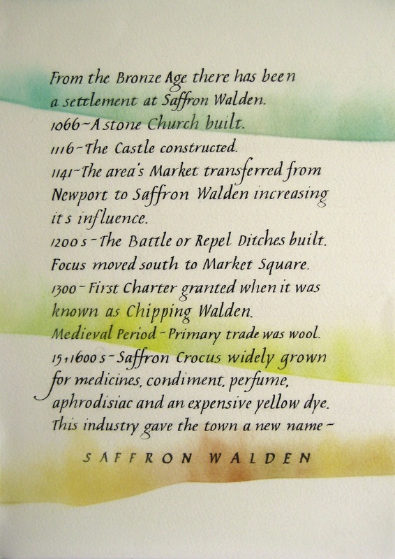
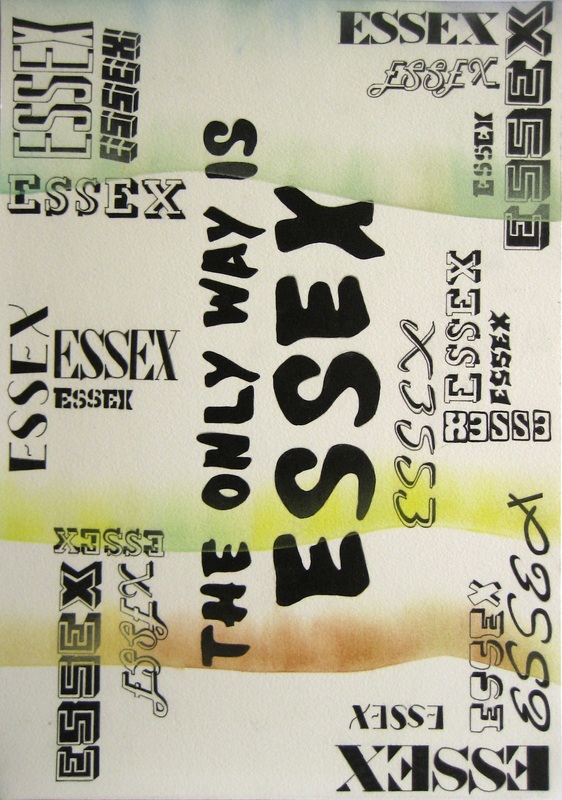
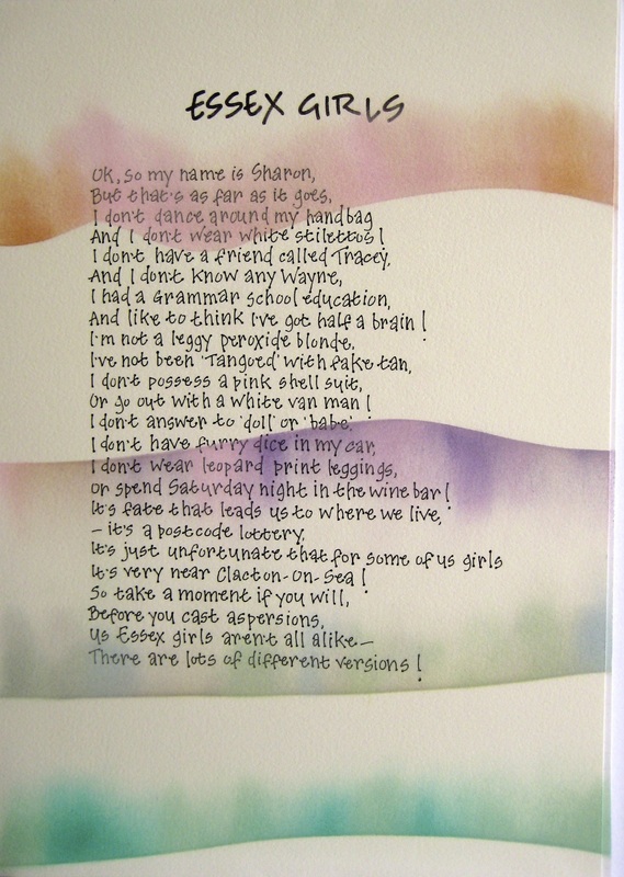
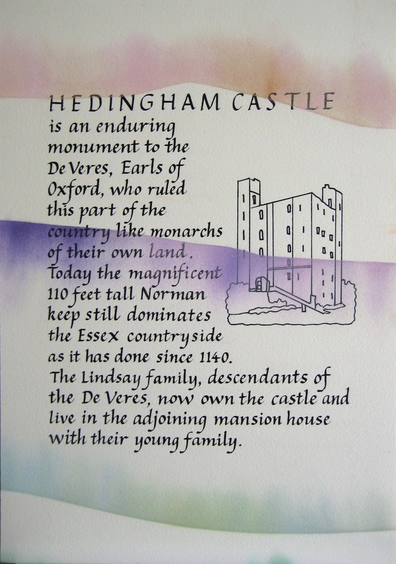
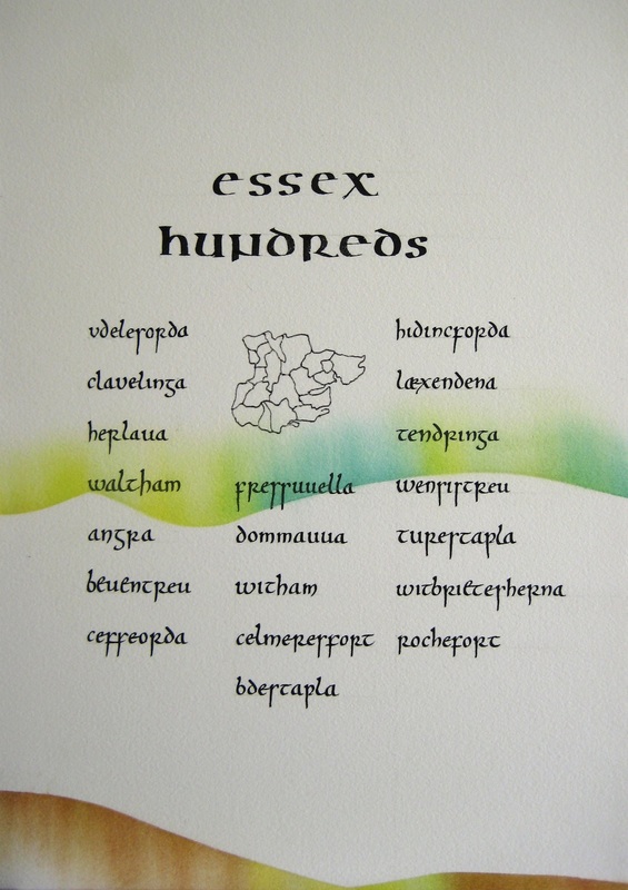
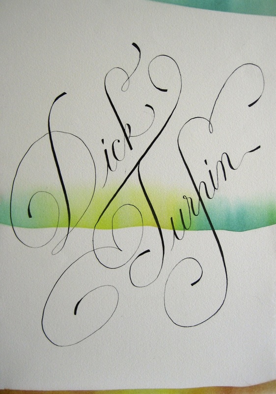
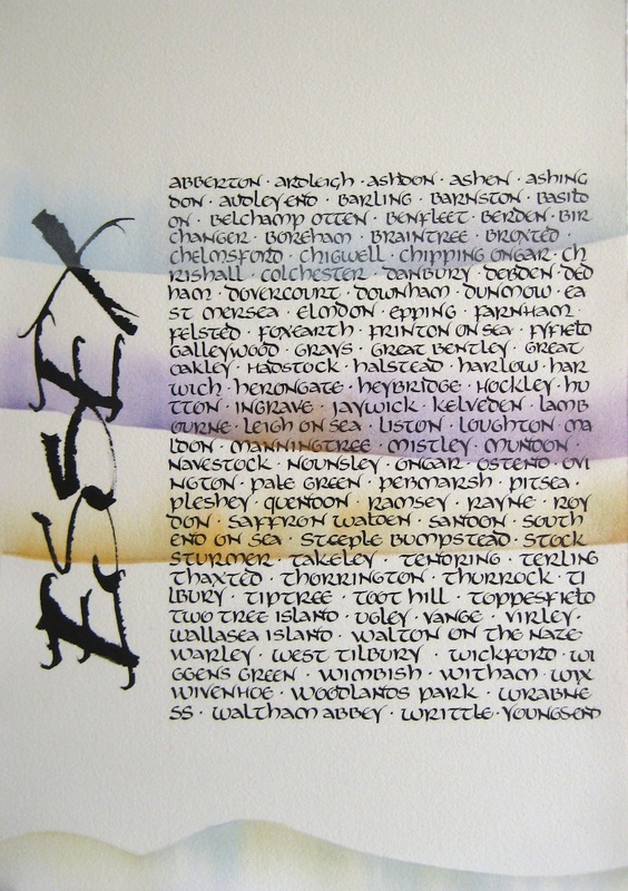
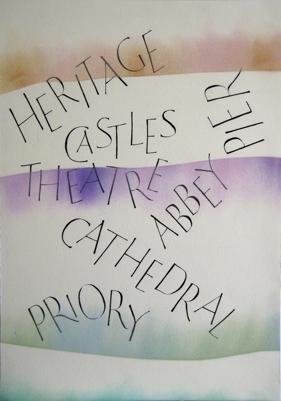
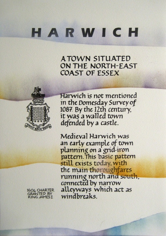
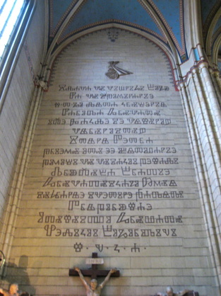
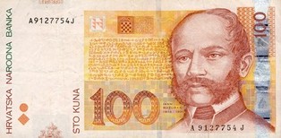
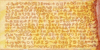
On a recent trip by train from London to Sicily, I built in a 24-hour stay in Naples but this created the dilemma of deciding what to see with such limited time? I opted for a visit to the Museo Archeologico Nazionale di Napoli as I'd read that it held a lot of 'treasures' recovered from villas in Pompeii and Herculaneum. The collection of bronzes was spectacular but I was drawn to the beautifully intricate mosaics and astounding fresco art, all so well-preserved. My photographs are only a sample of those on display and really don't do them justice but I hope they convey in some measure the incredible work of those Roman artists. (Apologies for slight blurriness on some - they were taken without flash or tripod). MosaicsFresco ArtRaw pigmentsIn August, St Albans Cathedral, in commemoration of the 800th anniversary of the city's role in the story of the Magna Carta, displayed an original document from 1215 as part of a special exhibition explaining the importance of St Albans Abbey in the document's history. As part of their celebrations, Paul Wright from the UK's only parchment producer, William Cowley, was demonstrating the ancient skill of preparing parchment for use. With a wetted goatskin stretched onto a frame, Paul showed everyone how to scrape the lanolin from the skin using a lunar knife, then let us have a go ourselves. It's a mucky business but the end result is a work of art in itself. One of the highlights of this year that I'm very much looking forward to is the "Living Letters V : Writing on the Edge" exhibition to be held at Foyles bookshop in London, which will run for almost the whole of October. The gallery space was offered to the Calligraphy and Lettering Arts society (CLAS) to utilise before the bookshop moves next door in 2014 and so they wasted no time in inviting submissions. The theme of the exhibition is Literature and Poetry, which is pretty much the best and broadest subject that any calligrapher can wish for. The possibilities are infinite! I am so pleased and excited that one of my own pieces was accepted for inclusion and will hang alongside some of the most talented calligraphers and Fellows of CLAS. The evocative words are an extract from "The Stark Monro Letters" by Sir Arthur Conan Doyle, and my interpretation is written in pencil and decorated with sumi ink, watercolour and a touch of pastel. 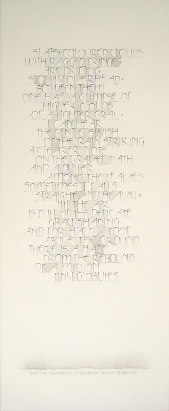 Above is the complete piece entitled "Rain", measuring approx 470 x 200mm, and below, details of the body of lettering and the credit. The exhibition runs from 2nd-30th October at Foyles Bookshop, Charing Cross Road, London. 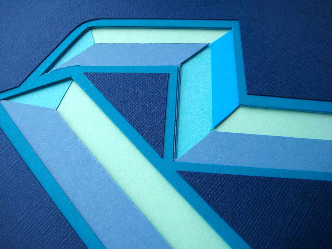 Over a long weekend in the middle of June, in a small village southwest of Cambridge, the superb American lettering artist, Carl Rohrs, held a truly memorable workshop that will be one of highlights of this year. I'm positive everyone who attended would agree. At times the array of tools and techniques Carl demonstrated could be quite bewildering - pointed brush, flat brush, folded pen, cut-paper lettering - but I'm sure it'll all sink in gradually with further practice using his unique and comprehensive workbook as a reference.  Carl’s incredible lettering workbook for "Pen, Brush, Stiletto" Here are some of my practice sheets using various tools : pointed brush, folded brass pen, flat brush. The difficulty lay not in using the brushes or pens as such, but in manipulating them to attain the desired effects! We also designed and cut a 3D letter in paper, which had a fantastic effect once all the coloured layers were stacked in their proper order. And finally...cut-out silhouette lettering with a decorative background. I was finishing this in the final stages of the workshop and, looking at it again, I think I could have chosen a better background. Somehow the Japanese Chiyogami paper suggests my home village is somewhere in the Far East of the world rather than the far east of Essex! This is written a little after the event as Lay Members' Day this year was held at the end of April but is it ever too late to share some good calligraphy stuff? I don't think so.  Saffron Scribes regional group is named after the town of Saffron Walden in Essex where it was originally established. It's a friendly and enthusiastic group interested in learning about calligraphy, lettering and other related skills, such as bookmaking and gilding. I very much enjoy being a member and attending the workshops. The group was very pleased to be asked to put together a display for this year's Lay Members' Day, held by the Society of Scribes & Illuminators at King's College in Waterloo, and immediately set about making plans for the stand. We all decided to prepare a group project specifically for display on the day and once we'd agreed the theme of "Essex", set to work with our individual contributions. The theme was purposely broad with no limitations on subject or style as long as it related to the county. However, there were some restrictions : to write two panels of A4 size with black lettering on a white background only. All the panels were then overlaid with a pastel effect to echo the colours of the Essex landscape, which brought the whole display together as a single piece. In the end we had 22 panels and here is the marvellous result of everyone's efforts! 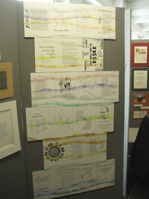 And a closer look at all of the individual panels... The Stand 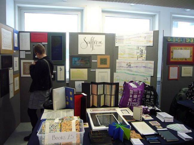 And here is the group's stand on the day, which shows the wonderfully varied gallery of individuals' calligraphy artwork displayed next to the Essex theme and on the table. Bags and books too! 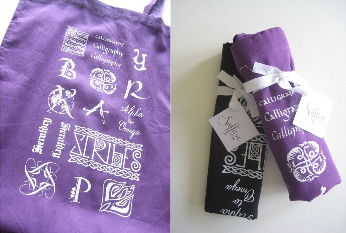 Every member also contributed one or more letters or words for printing onto bags - a purple shopper and a drawstring in black - and many also pitched in to create an attractive range of quality hand-made notebooks, all to raise funds to keep the group going. 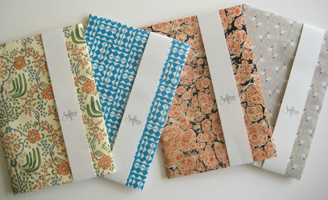 Originally written and published 12 November 2012 During a recent trip to Zagreb, I was fascinated to learn that a distinctive and decorative alphabet called Glagoljica (Glagolitic) exists that was used for centuries in Croatia before Roman lettering became dominant. 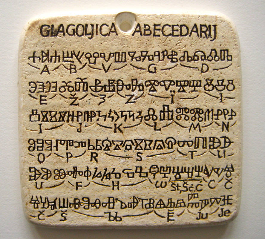 Small souvenir Small souvenir Whilst strolling through the city, by chance I wandered into a souvenir shop that had many items on display adorned with various unusual letter shapes. I thought they were ancient runes but the shop owner (who luckily spoke good English) showed me a poster she had for sale entitled “Glagoljica” and explained that they were letters from an old Croatian alphabet.
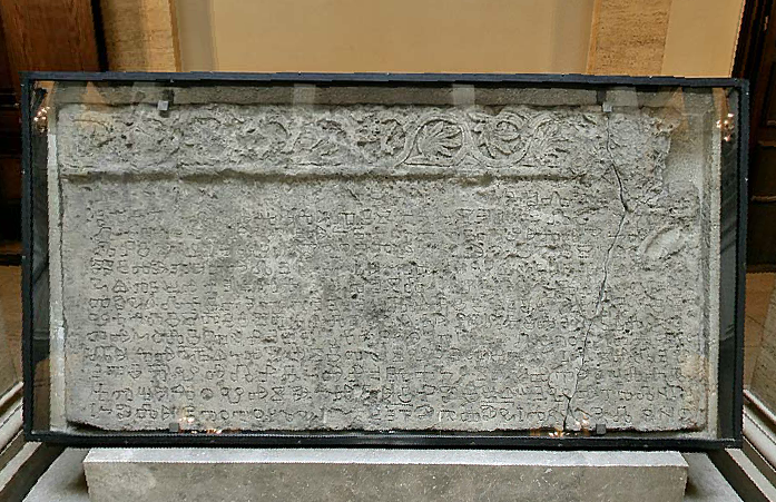 Baska Tablet behind glass 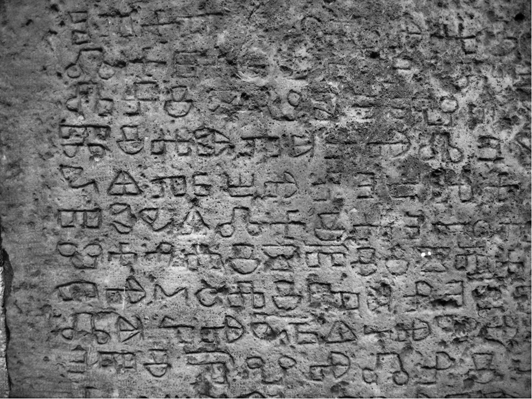 Section of Baska Tablet After the tablet was found, it then took almost 25 years before a full translation was completed but, unfortunately, the subject matter was not very exciting – it commemorates a gift of land by King Zvonimir to the church and gives details of attendees at the presentation ceremony. However, that is not so important as its real value lay in its use as a resource for studying both the development of Glagolitic script as well as the Croatian language.
The Croatian Academy of Art and Science website is here. My heartfelt thanks to the lady who owns Gallery Gea, Radeceva 35, Zagreb. |
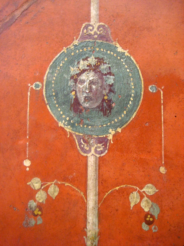
Julie ChaneyThis is a little corner where I like to share my love of calligraphy & letterforms and my fascination with the tools, materials & methods used to create and display them. I also love patterns and carved faces! Archives
August 2018
Categories
All
© by Julie Chaney. All rights reserved
|


 RSS Feed